5 easy tips for creating captivating YouTube Thumbnails
·

5 easy tips for creating captivating YouTube thumbnails

If you’re a business owner, you might think that creating captivating YouTube thumbnails is hard, but it’s actually really easy. All you have to do is think of thumbnails as book covers. The only difference is that on YouTube, you are judging a book by its cover. If you’re just starting off making YouTube videos, the thing that will get viewers to click on your videos (besides SEO), is your thumbnail. Here are 5 easy tips for creating captivating YouTube thumbnails.

5 tips for creating captivating YouTube thumbnails

If your video is showing up on searches, you want to be the video that viewers click on. If the title and content are the same, hopefully, your content matches the title, the best way to stand out is your thumbnail. As a beginner starting off on YouTube it’s important to focus on the design of your thumbnail. Let’s get started.

01 Put a face on it

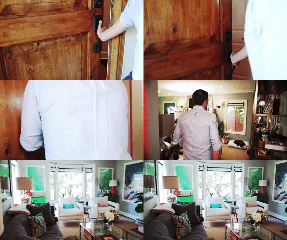
It’s time to start posing because faces are the way to getting noticed. No, really. A thumbnail with your face on it is more likely to get clicked on than a thumbnail without a face. That’s probably why you see all those goofy and extreme facial expressions on YouTube thumbnails. Am I telling you to go that extreme? No, but if you’re making videos showing your face anyway, then you might as well put it on your thumbnail.
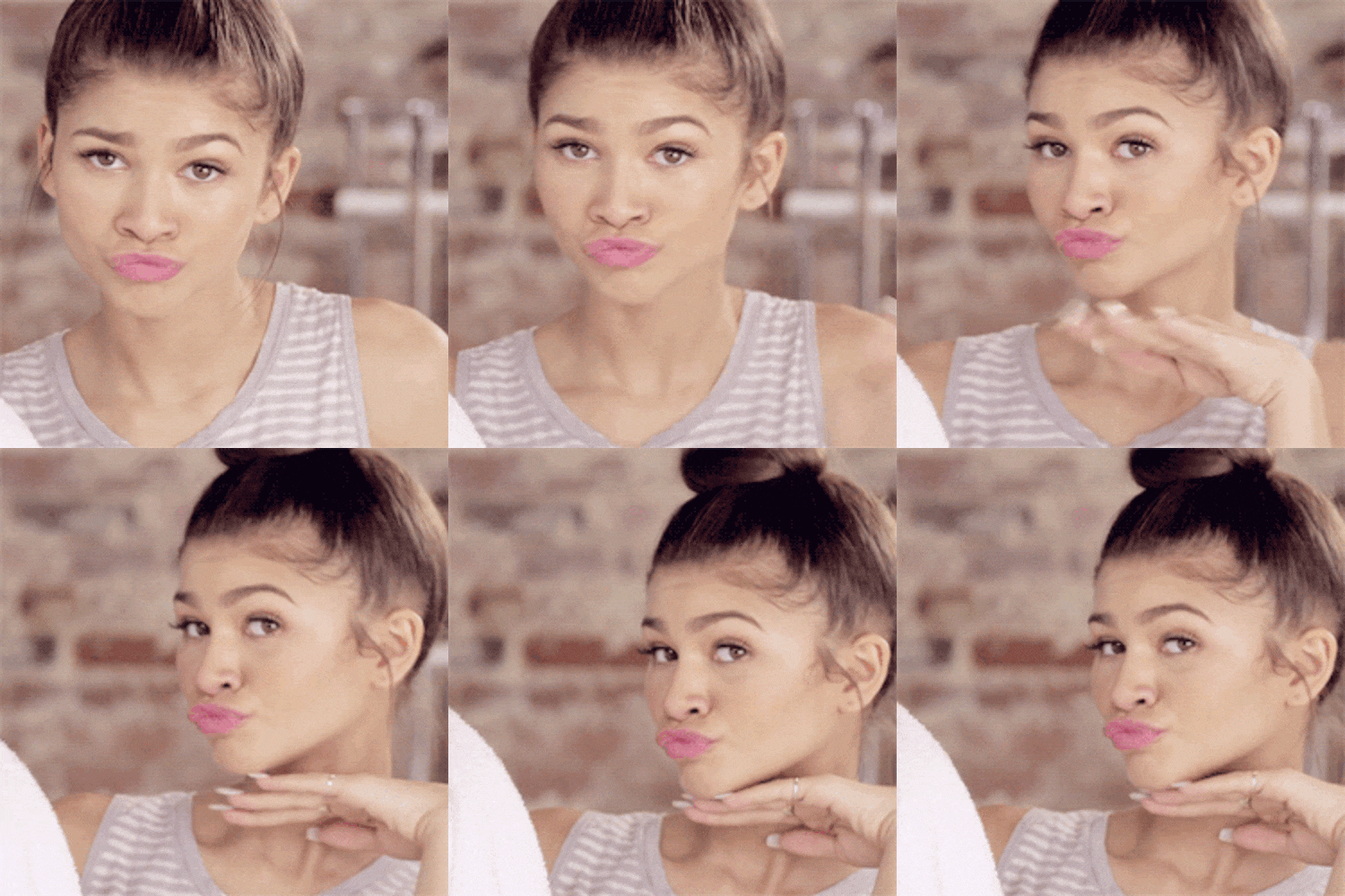
put a face on it


The easiest way to get your image is to make a still image from your video content. Sometimes this doesn’t always work, especially if you care about the way you look. I’m not going to lie, I definitely care about how I look, so when I’m editing videos, I try to pick a video that makes you look good. If you’re editing your own videos, there will be more times when you pause your video and you’re making an ugly face than a flattering one.

Because I know that image is important, I tell my clients to pose at the beginning of their video. Hit record and pose for 5 seconds, then do another pose, and another. It feels dumb, but you’ll have thumbnail choices that you won’t hate. If that’s too embarrassing or you want to have more control of your image, I have a client that takes selfies instead and gives those to me for her thumbnail options.

02 Text is everything
 

put text on your thumbnail


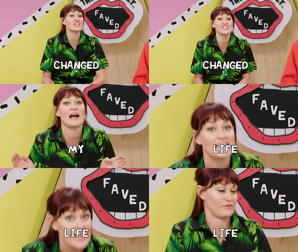
When you’re starting off with vlogging, having text on your thumbnails is really important. Why? Because no one will click on a video if they don’t know what it’s about. Here are some tips on creating the title for you YouTube thumbnail:

  1. Make sure the title is relevant to your YouTube video.
  2. Your thumbnail title doesn’t have to match the YouTube title.
  3. Try to make it short and catchy.  Most people are skimming thumbnails.

BRAND YOUR YOUTUBE CHANNEL

Stand out online and learn how to brand your YouTube channel in this 5-day email course. You'll also be subscribed to 'On Wednesday, We Go Rogue' and get access to the Go Rogue Library.

When you make it to the big time, you won’t have to worry about it. That’s why you see big accounts sometimes don’t have text on their thumbnails because people already know who they are. Read More “5 easy tips for creating captivating YouTube thumbnails”


7 video content ideas for businesses on YouTube to help grow their following
·

7 Video content ideas for businesses on YouTube to help grow their following

If you’re on YouTube, you’re trying to stand out with your content and attract your target audience and get them to subscribe to your channel. You know what’s not going to get subscribers? Boring how-to videos. I’m not saying to stop doing those videos. In fact, I think they’ll attract your audience. People go to YouTube to learn how to do things. BUT, if you want them to hit subscribe, then you have to think like a lifestyle vlogger. That’s why I created 7 video content ideas for businesses on YouTube to help grow their following.

Why think like a lifestyle vlogger? If you’ve ever been on YouTube, you’ll notice that these people are like celebrities.  Viewers watch their videos mainly because they can relate to them or want to become them. It’s rare that people will subscribe just to learn something. In fact, a lot of people love to binge watch videos when they go on YouTube. Who wants to binge-watch educational videos?

Basically, you have to build a connection with your audience. Your viewers have to form an attachment to you, and the best way is to think like a lifestyle vlogger. Below are 7 video content ideas to add personality to your channel.

7 video content ideas for businesses on YouTube

01.  Behind the Scenes or Inside look

You can do a behind the scenes look at your office or a process of your business. This is the number one reason why we stalk celebrities. We want to know their daily routine, how to be as successful as them, and just everything about their life.

Tour


Business video ideas:

  • Inside look at your morning routine
  • An inside look at how you stay productive
  • Behind the scenes of your work process
  • Inside look at how you plan your work day

02. Monthly favorites

If you’ve watched lifestyle videos, you’ll notice that there are quite a few ‘Monthly Favorites’ videos. These videos consist of products that vloggers loved that month. You can take this same concept and use it for your business. Also, if you’re an affiliate, this is an extra way to promote to your audience without being too salesy.


Monthly favorites


Video ideas:

  • Book reviews
  • Favorite tools that you’re using
  • Favorite product that you’re using in your business or that helps your business

Read More “7 Video content ideas for businesses on YouTube to help grow their following”

5 reasons a youtuber needs a graphic and web designer

5 reasons a youtuber needs a graphic and web designer

If you want to be legit on YouTube, it’s not about filming and uploading anymore. With all the competition, users are looking for high-quality content to consume. Everyone knows that audio and video quality are important. In fact, it’s easier than ever to record high-quality content with just your phone. So what’s the next step? Design. To look professional, you need a brand and a website. Here are 5 reasons a Youtuber needs a graphic and web designer.

5 reasons a Youtuber needs a graphic and web designer

It’s time to look professional. I’m not talking about wearing a suit and tie. I’m talking about looking like a legit business, or an authority in whatever content you’re creating.  It has to look like you have a production team producing your video, even though it’s just one person. Besides saving you time and energy to focus on creating your videos, here are the ways that a designer can help elevate your YouTube channel.

01. Logo and branding

One of the first things you must have to look professional is a logo. Your logo will be everywhere and help with brand recognition. You’ll use your logo on your YouTube channel in the channel art, your YouTube video, on your website, media kit (if you plan to apply to affiliates), business card (if you plan to network), and so on.

Besides your logo, you also need a graphic designer to research and develop your brand. Why is branding important? You can think of it as creating a signature style for your channel and other assets. It keeps everything consistent. You’ll use the same fonts, colors, imagery, and so on. Sounds boring, right? Well, this helps with brand recognition. If you keep using the same style, people will start to know you for it. Not only that, but it saves you time in content creation. You’ll never have to guess which font and colors to use because it’s already decided.

02. Title graphics and channel art

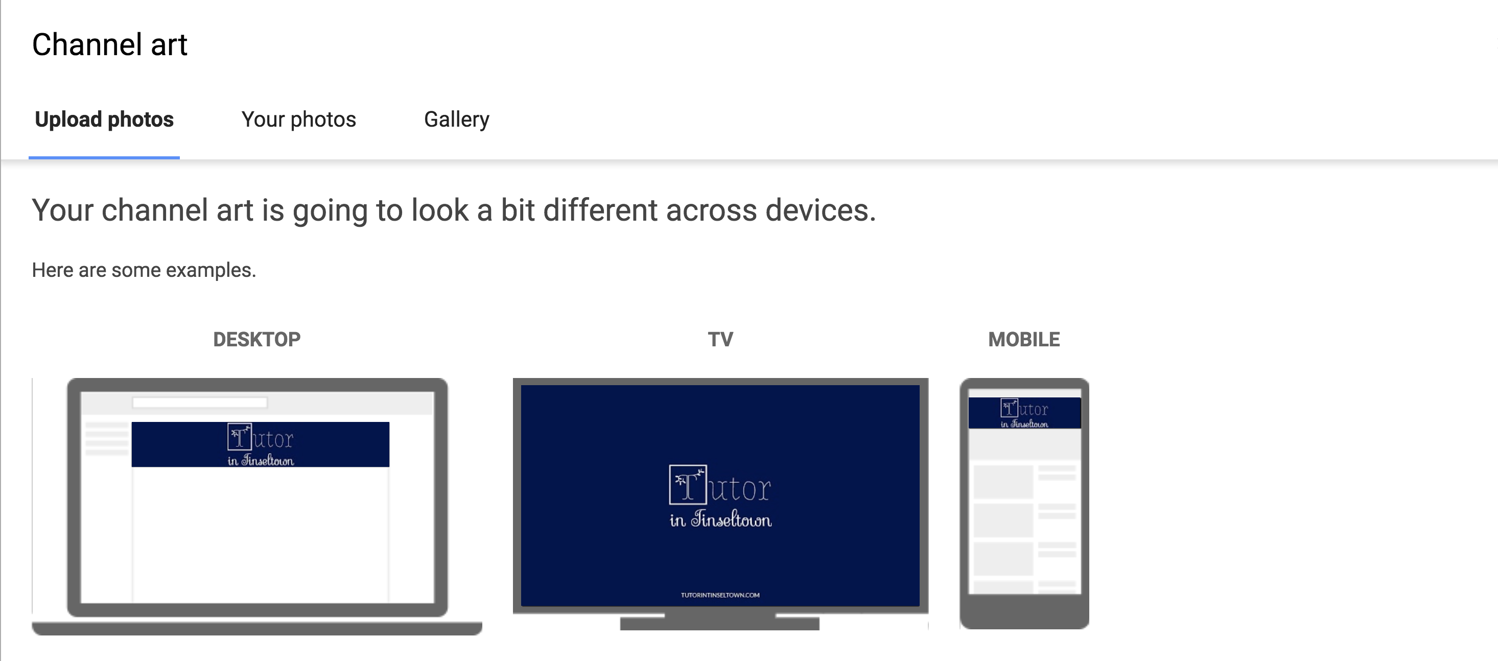
A graphic designer can design your channel, title, and thumbnail graphics for your videos. If you already have an established brand, this will help with brand recognition. For your YouTube channel, the cover art is the main graphic on the page. It should showcase the important details of your channel.

Another thing you might not think about is the branding watermark on the bottom right side of the video. This graphic is usually the logo, but it could be a submark or an icon that’s relevant to your brand.

Tutor in Tinseltown YouTube Channel art


Thumbnails are the first thing people see when they’re browsing videos. Great thumbnails will obviously get more click-throughs. Not only that, but some people will also use title graphics in their videos to showcase what the video is about. Check out this video from Jenn Im for an example of cool title graphics. You’ll see that her thumbnail video and title graphics are completely different. Read More “5 reasons a youtuber needs a graphic and web designer”