If you didn’t know, before I studied design and front-end web development, my background was in Radio/TV/Film (RTVF). My main responsibilities included writing scripts, revising scripts, filming, and editing. In fact, when I decided to join the Interactive Media Certificate Program (IMCP), I only joined to learn how to create animations (not knowing that it concentrated more on design) but fell in love with design instead. Here are 3 ways my RTVF degree made me a natural designer.
The top 3 ways my RTVF Degree made me a natural designer:
01. I have a natural eye for composition
In high school, I took Photojournalism (because I wanted to learn how to create photos in the darkroom), and during that time my teacher told me I had a natural eye for composition. Honestly, I didn’t know what she was talking about. She said that I would understand if I studied photography more.
It was never my intention to study photography, but I did want to become a filmmaker, so I decided to major in RTVF. In RTVF, if you concentrated more on television or film, you had to learn about using cameras. The TV studio cameras and the camera used for filming were totally different but applied the same techniques.
All you had to do was frame the main subject and object as it pertained to the story, or at least that’s how I thought of it. Because we learned about how each shot and different close-ups can convey a different atmosphere, I’m always aware of this when I film or photograph anything.
Fast forward to IMCP, again my teacher told me I had a natural eye for composition, except I understood what he meant then. At the time, I don’t think it was natural. I was accustomed to looking through the camera lens to create the best shot when filming, so it came naturally when composing graphics. I didn’t even know, I just wanted to be able to create a story with my graphics.
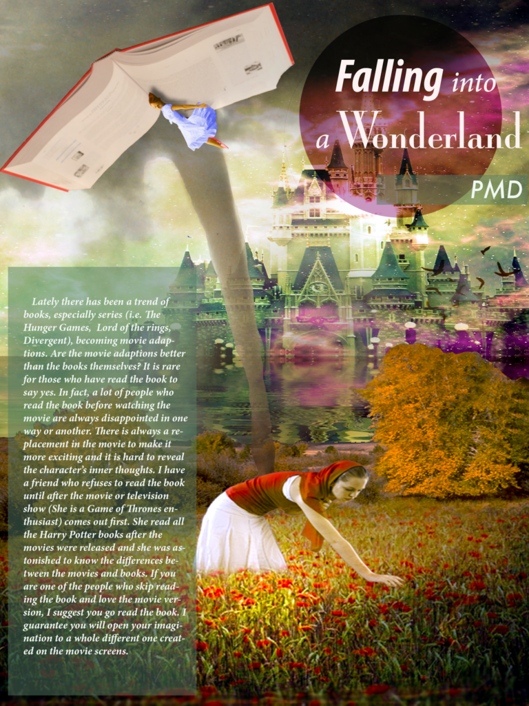
For example, for the project below, I wanted to create a fairy tale/Alice in Wonderland atmosphere. This is a collage of different images coming together to tell a story. Because they were different images, it was difficult to match the lighting, but the way I composed the image you can see the story taking place.

02. I know how to set the mood
When you’re creating a story, you have to think about the mood or atmosphere of the story. Is it bright and cheerful? What colors are associated with that? How can I create a brighter atmosphere? Is it dark and suspenseful? What will make it more thrilling? How can I create a dark mood?
I’m always thinking about what will set the mood. This hasn’t changed at all in my design process. I’m constantly changing the mood of photos to fit the brand that I am creating.
The main ways I change the mood are by changing the lighting, mood, and composition of the photo. The first thing I do to a photo is optimized it in Photoshop. Then I change the hue and saturation of the photo to fit the atmosphere that I’m going to create. Then if I’m still not satisfied with the overall ‘feel’ of the image, I’ll select the object in the image I want to change. I’ll edit that object by changing the color or moving it to become a part of another image.

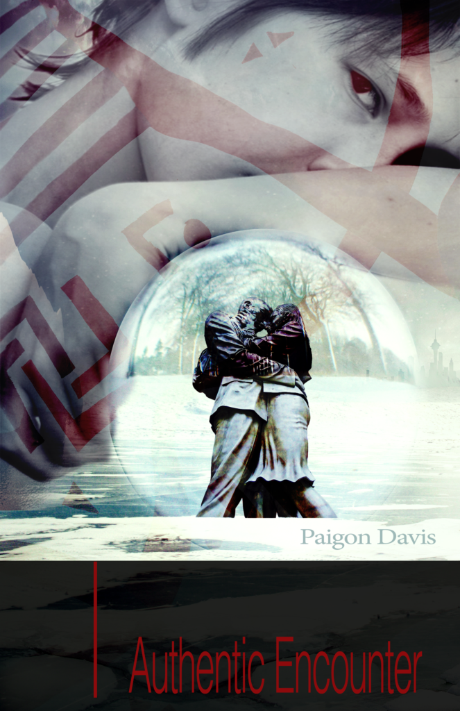
In this design, the theme was ‘Authentic Encounter’. Since this book was about an alien learning how to interact with humans, I wanted to create an atmosphere that was based on emotion and relationships.
03. I’m a natural storyteller
I’m still a filmmaker at heart. I want to tell a story with my graphics. Yes, the images that I create are pretty, but I like to know that it’s creating a story. That’s why I’m in the business of designing brands and websites that tell stories for confident and bold, creative entrepreneurs.
Instead of using a script to create stories, now I use adjectives. When a client books my service, one of their homework assignments is to answer a questionnaire about their brand. One of the questions asks to list the adjectives that describe their brand. I use those adjectives as references as I’m designing the client’s project. Each element: colors, typography, logo, icon, and so forth, are created to create the brand’s story.
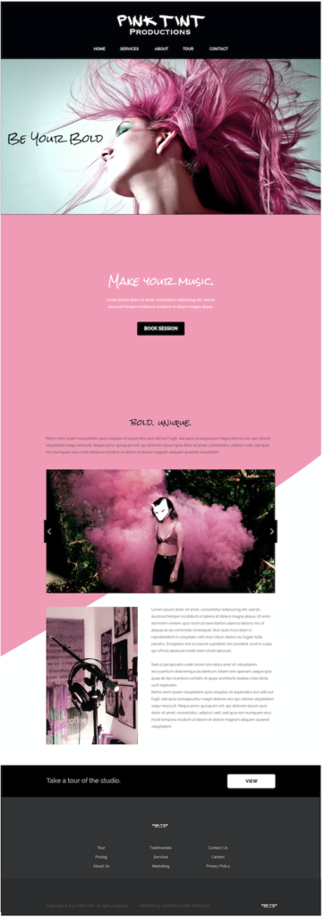
For Pink Tint, you see that all the elements came together to create a bold, fun, high energy brand.

Exciting news!
I decided to create a package that will cater to entrepreneurs who create video content. This new package will include my branding and web design package, but will also add video intros and outros and other designs related to video content. Stay tuned for this future package.
-Paigon | Natasha Lane Design Co.

