*This Brand x Web Design for Death by dessert is a fictitious company for my portfolio.
Overview
Death by dessert is a cafe that specializes in a variety of desserts and beverages. They differ from other cafes and coffee shops by having a bright and relaxed atmosphere. The cafe leans more towards a cutesy style without being too feminine.
Target Audience
The target audience is between 13-40. Customers include teenagers who love to eat and gossip with friends, college students studying for upcoming exams, and families who like to eat desserts together.
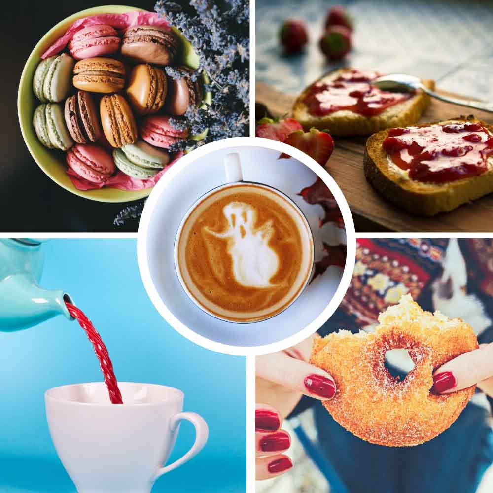
Inspiration Board
Here are the images that inspired the brand for Death by dessert.
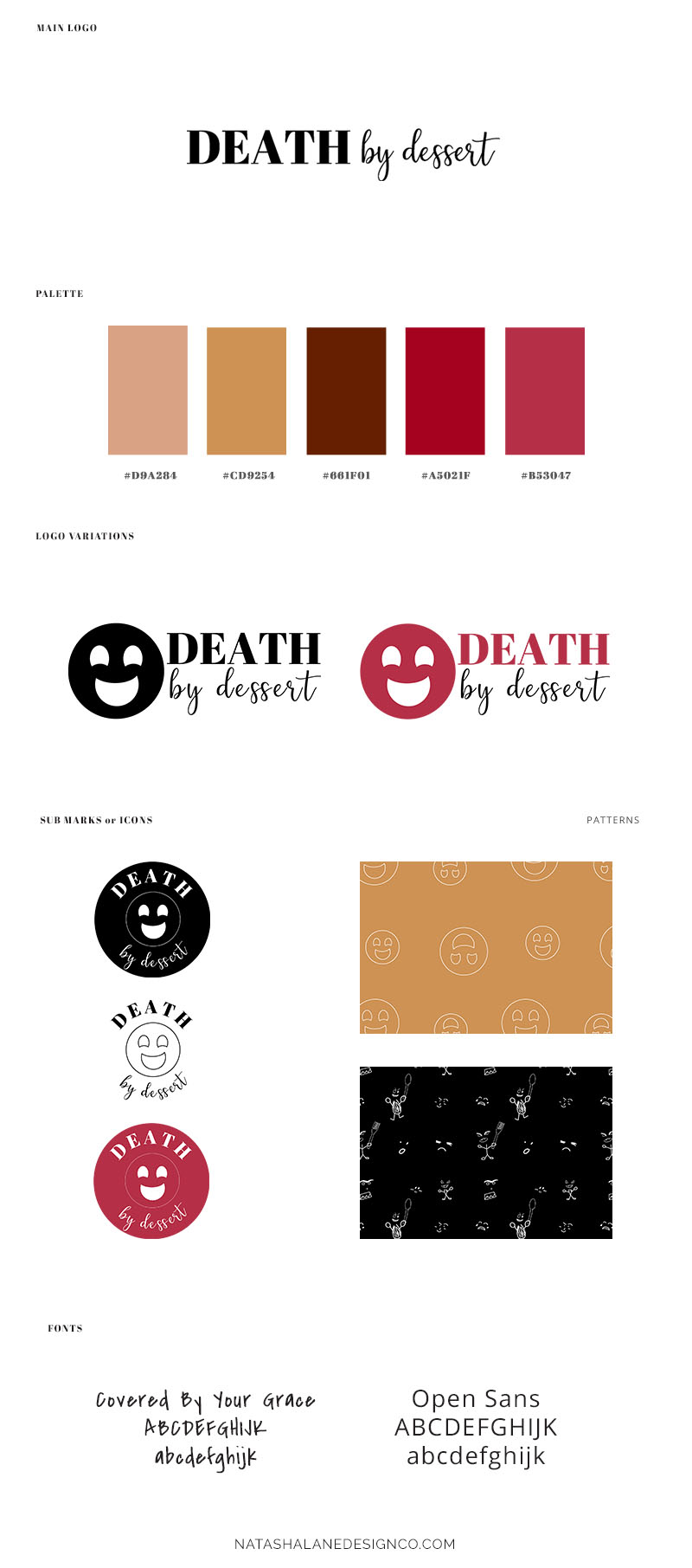
Logo
The main logo.
![]()
The variation logos for Death by dessert.
![]()
![]()
The submarks for Death by dessert.


Brand Board
The brand board showcases all the elements of the brand like the logo, typography, and color palette.
Collateral items
This is the menu for Death by dessert.
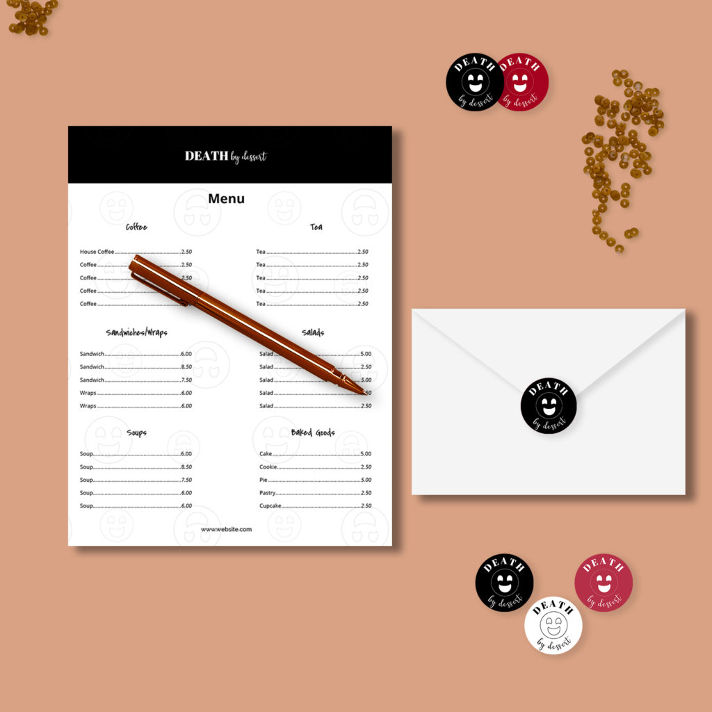
Business cards and direct mailer for Death by dessert.
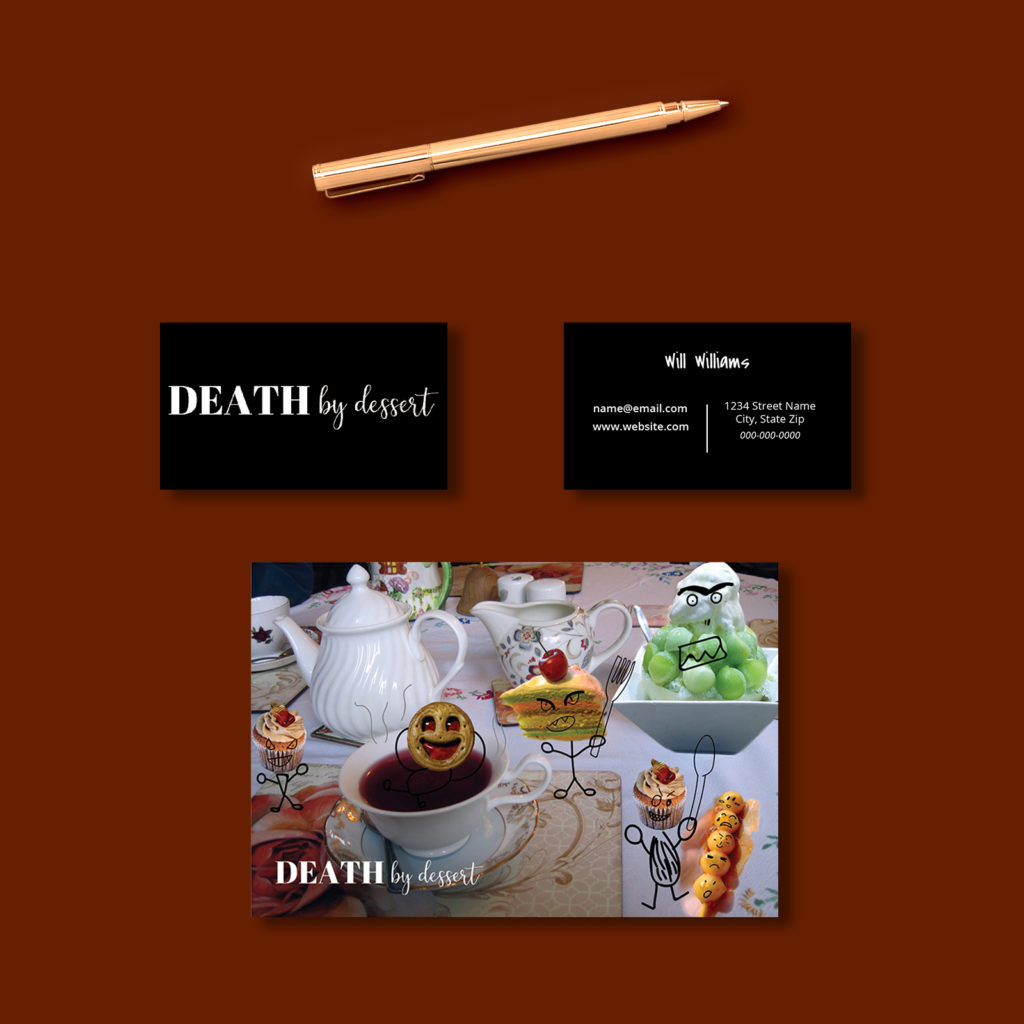
Examples of social media templates.

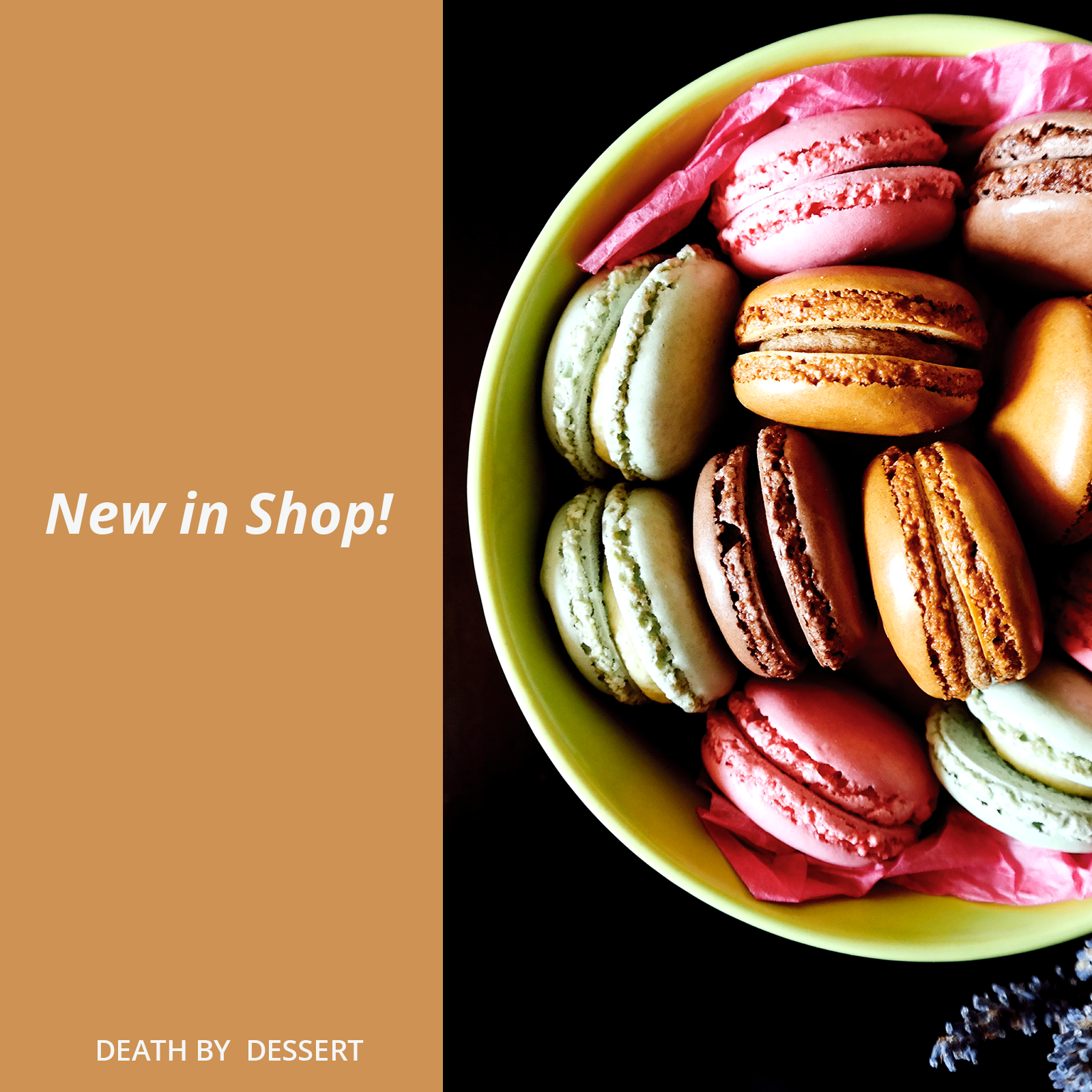
Website
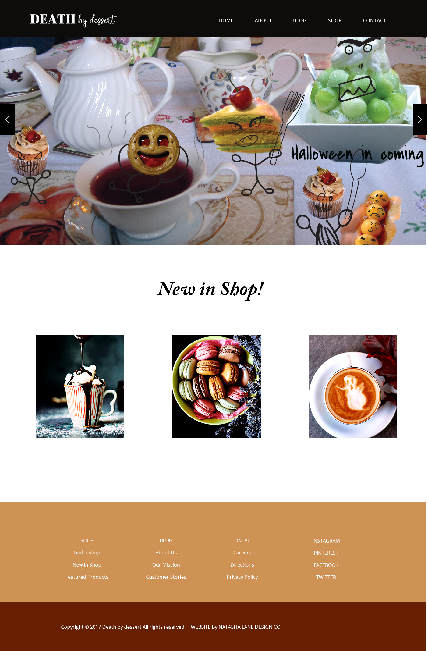
Designer: Paigon Davis
Package: Brand x Web Design
View the website here.
This is from on the logo x branding template. View the Logo x Branding template here.
Project Summary
Colors found in food were incorporated into the Death by dessert brand. The main colors are derived from chocolate, coffee, and fruits. Even though some of these colors can be construed as dark and sinister (the red created a murderous gingerbread face at one point when I was experimenting with the submark), the overall brand elements help create a fun theme.
A handwritten font was chosen to depict a down to earth brand, and the gingerbread man face pattern depicts a fun, ageless element without being too cutesy. Adding doodles to the cafe elements create a cafe with a personality, as opposed to some cafes that emit more of a business atmosphere.
Overall, the Death by dessert brand still has a bright, relaxed, and fun atmosphere that can attract families, teens, and young adults.
If you have any questions or comments about this portfolio, feel free to contact me or comment below.
[thrive_2step id=’3720′]
 [/thrive_2step]