*Hue x Blush is a fictitious company for my portfolio.
Overview
Hue x Blush is focused on beauty and fashion. They began as one lifestyle blogger and expanded into a company that shares articles and videos on women’s needs.
Target Audience
This site caters to women 16 to 45. They give advice on fashion, beauty, fitness, career, and health. Their target audience loves to read Shape, Marie Claire and they love to watch shows like The Mindy Project and Ugly Betty.
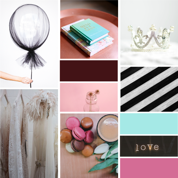
Inspiration Board
Here are the images that inspired the brand for Hue x Blush.
Logo
The main logo.

The variation logo.
Brand Board
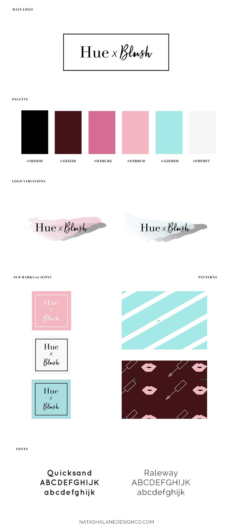
This board showcases the final logo, typography, color palette, and so on.
Collateral items
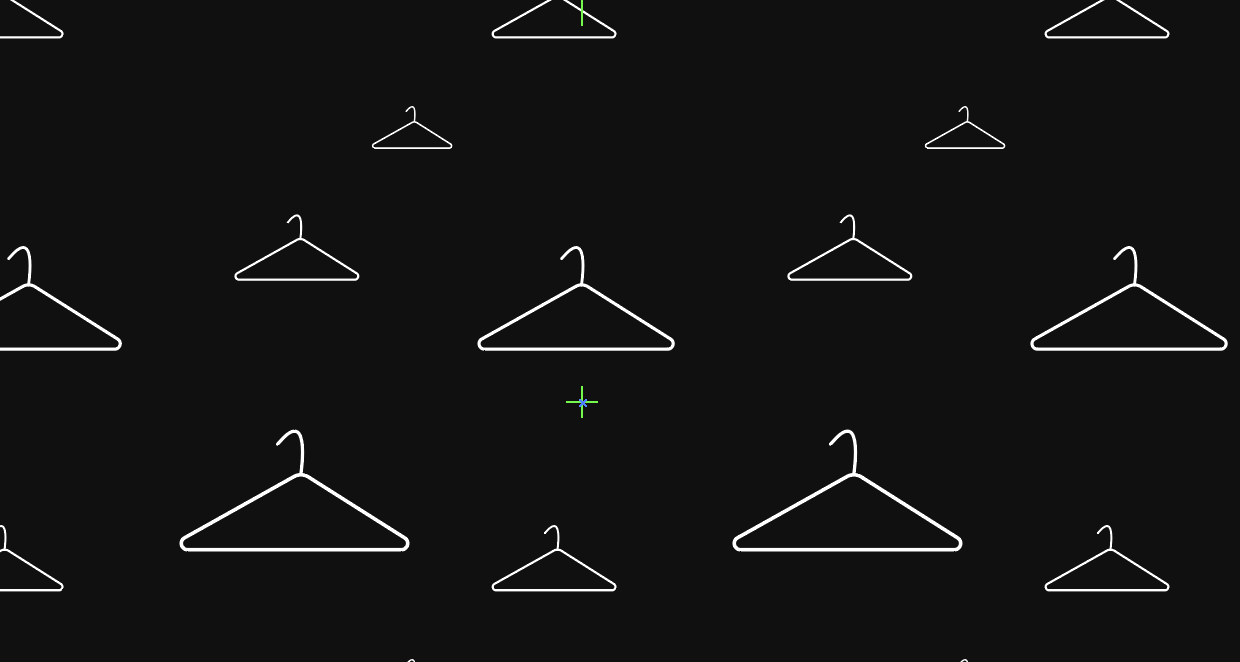
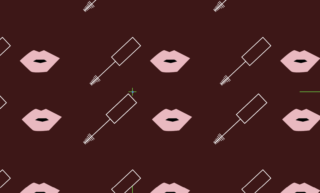
Patterns
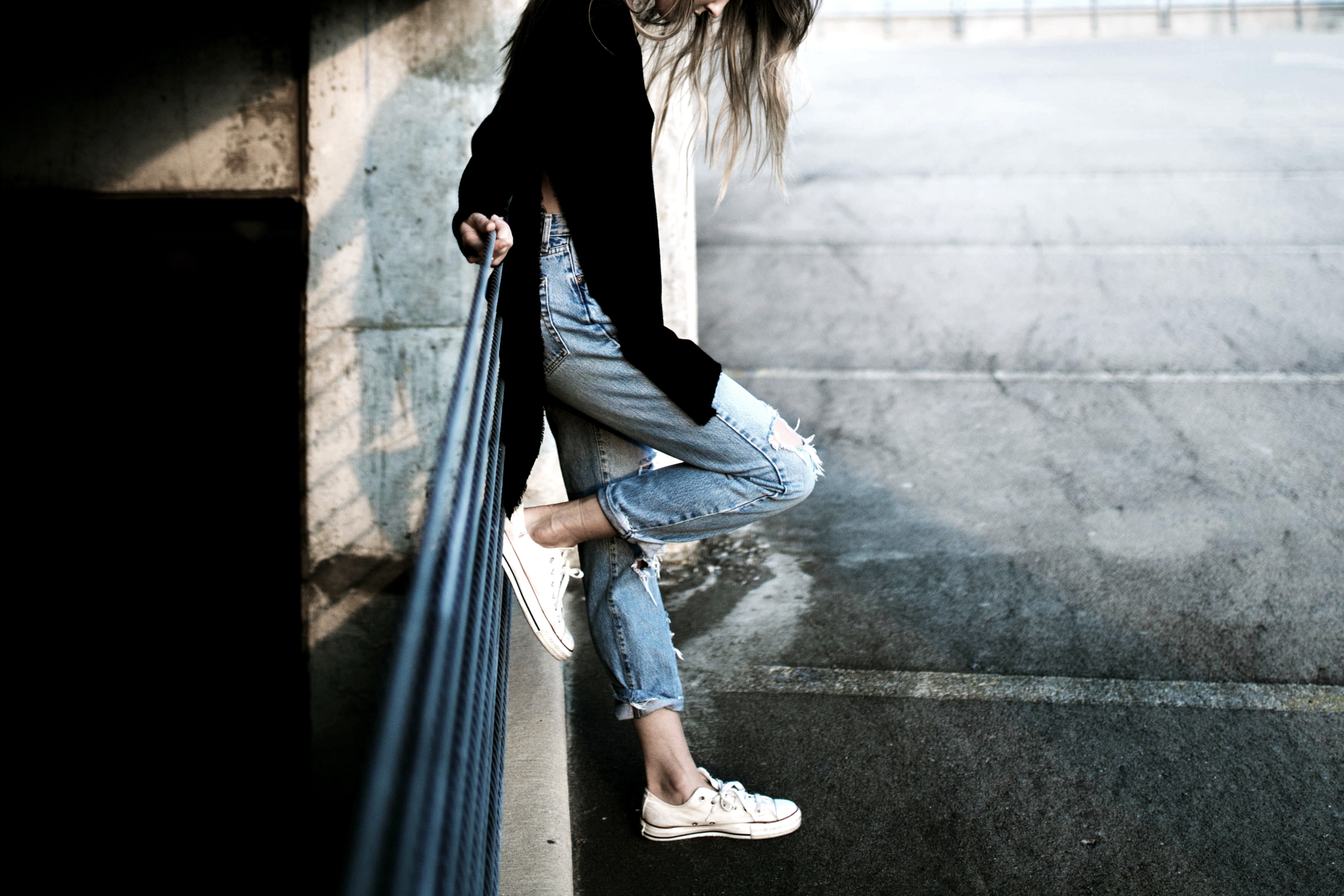
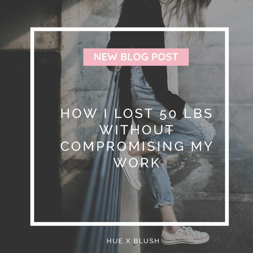
Blog Post Graphics
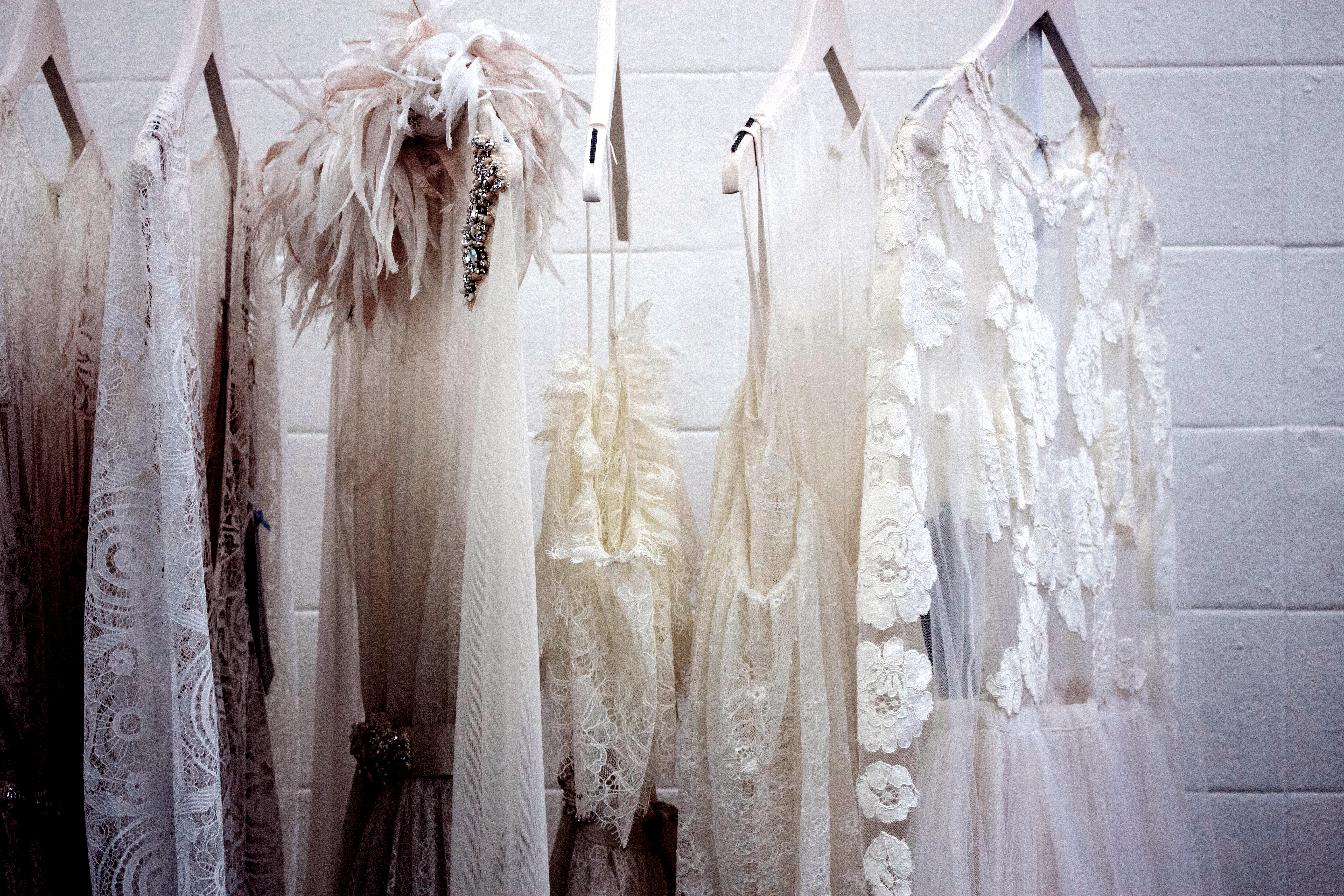
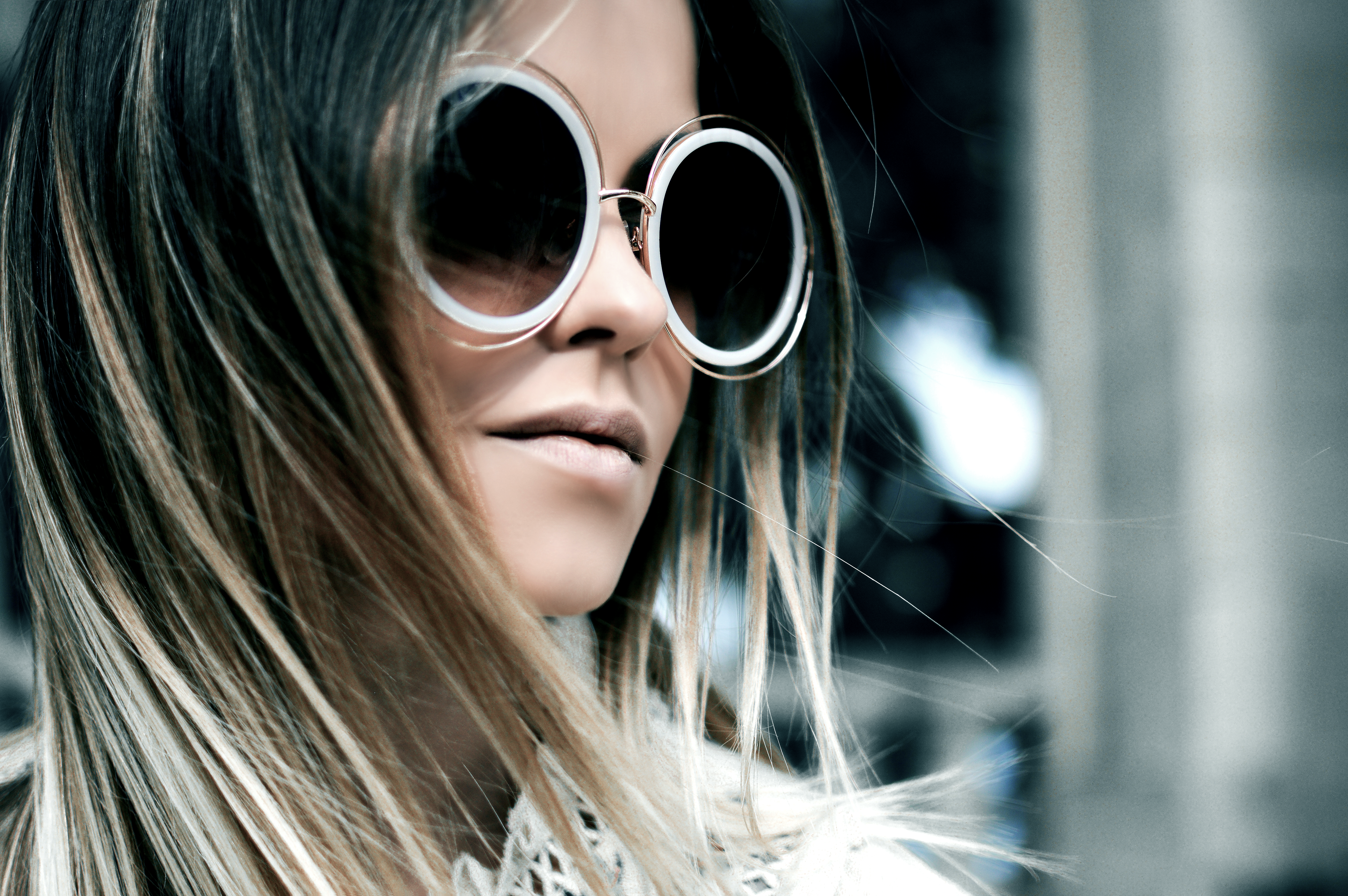
Hue x Blush is image-centric, so they just needed images that were edited to fit their brand.
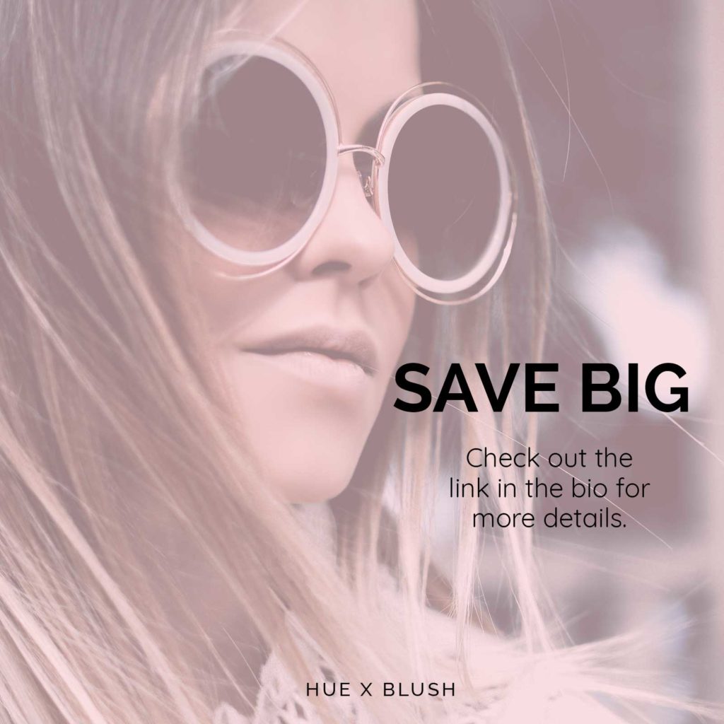
Social media templates
Video Title Graphics
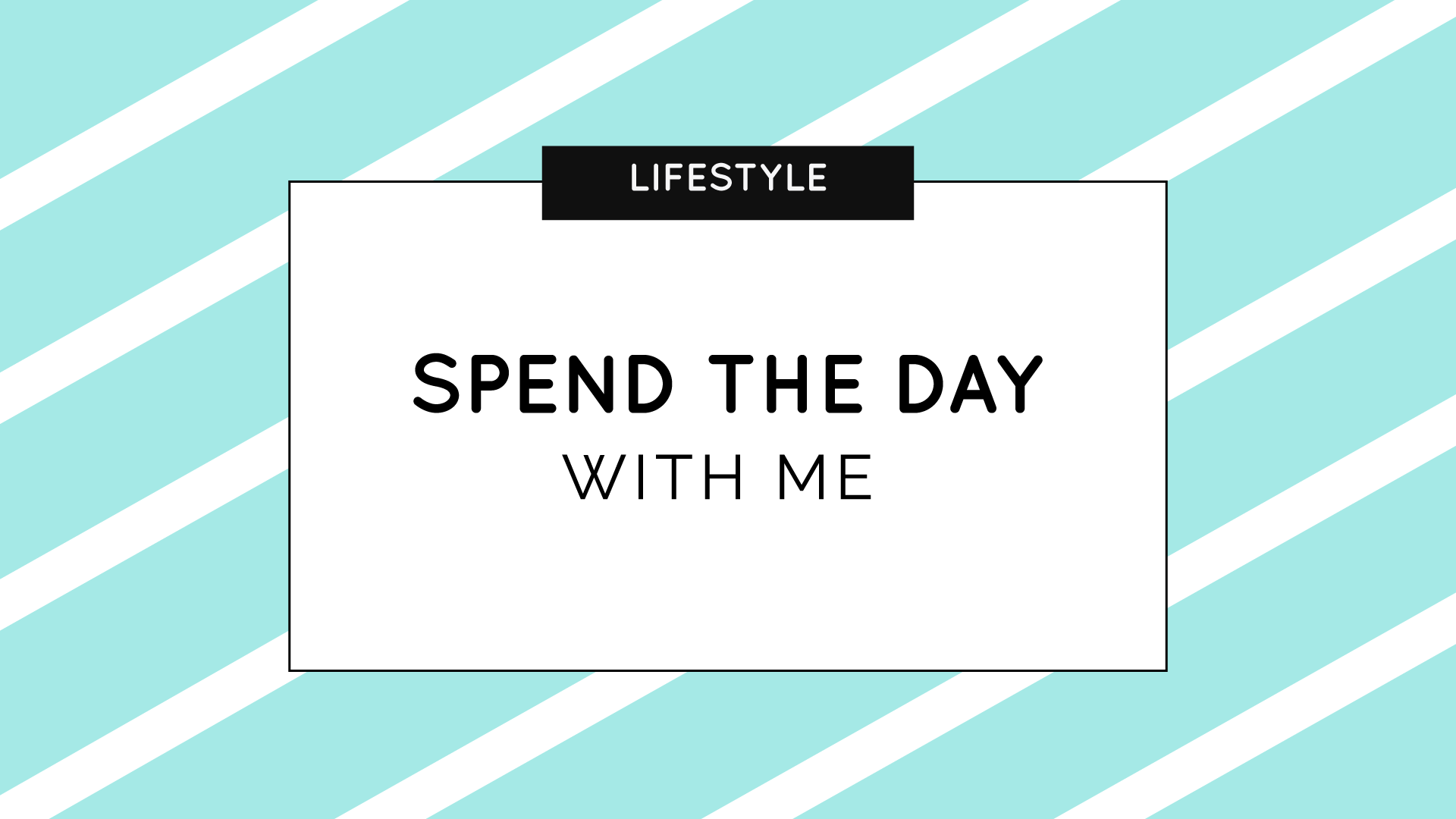
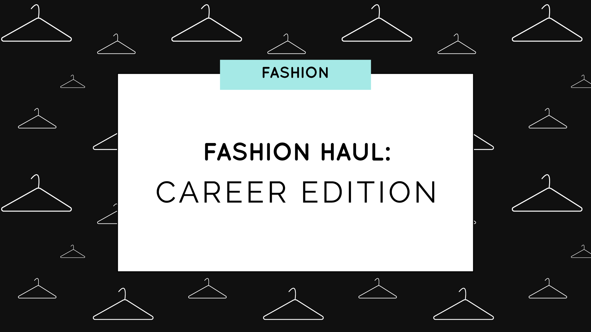
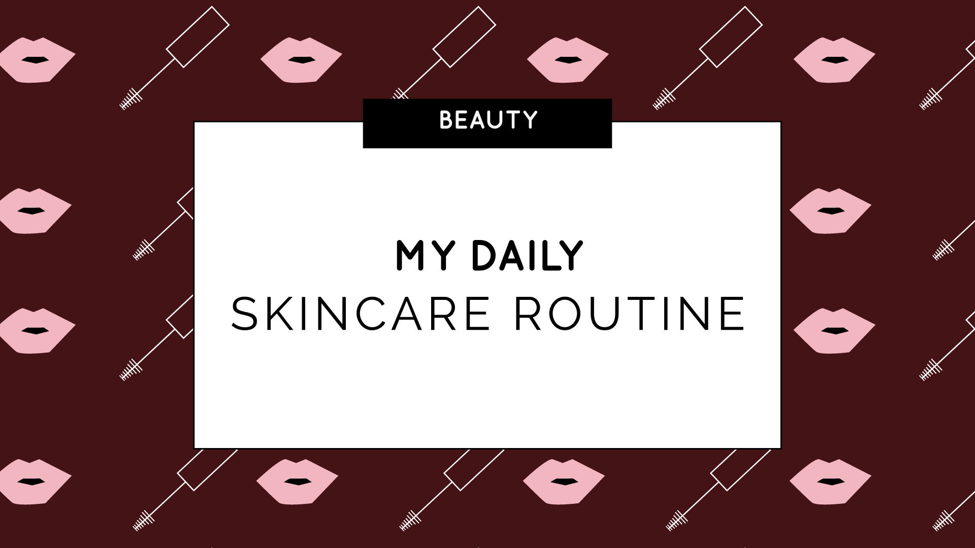
The intro video
Outro graphic
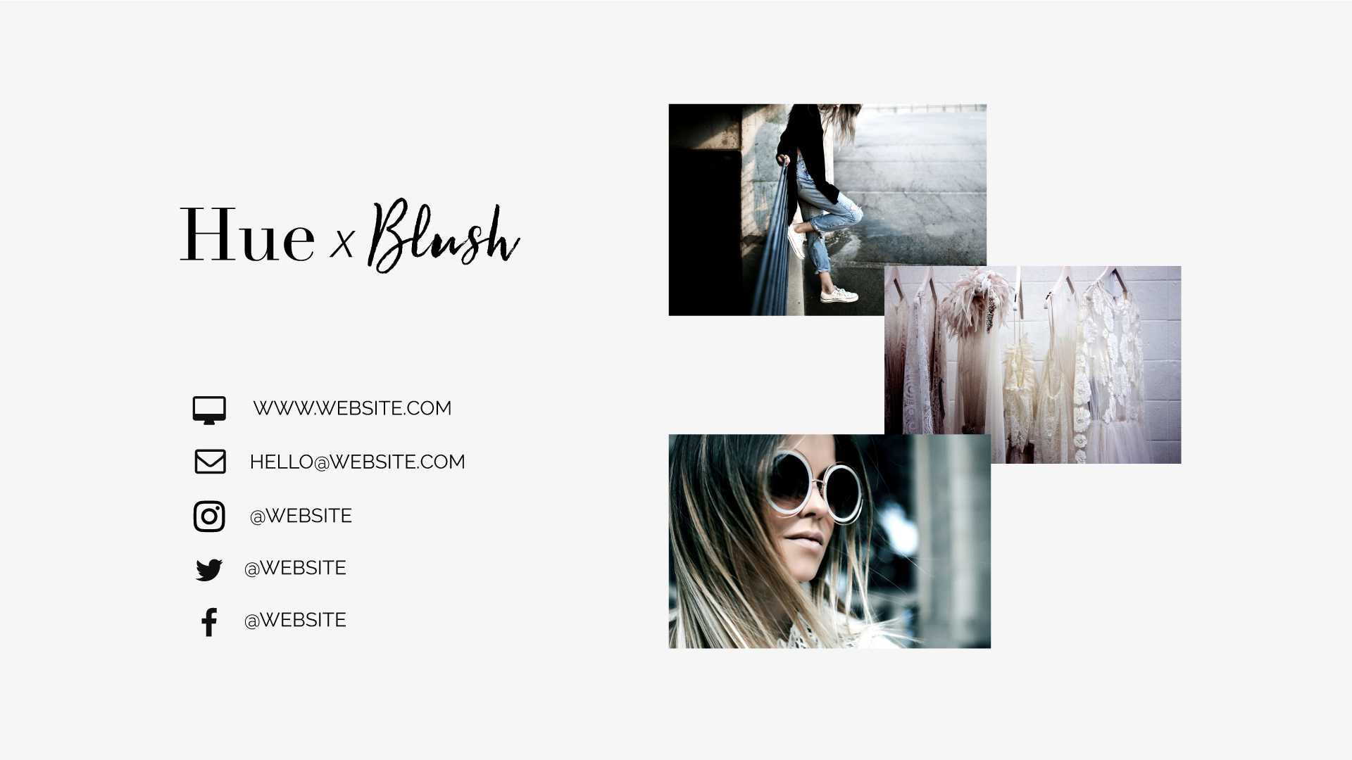
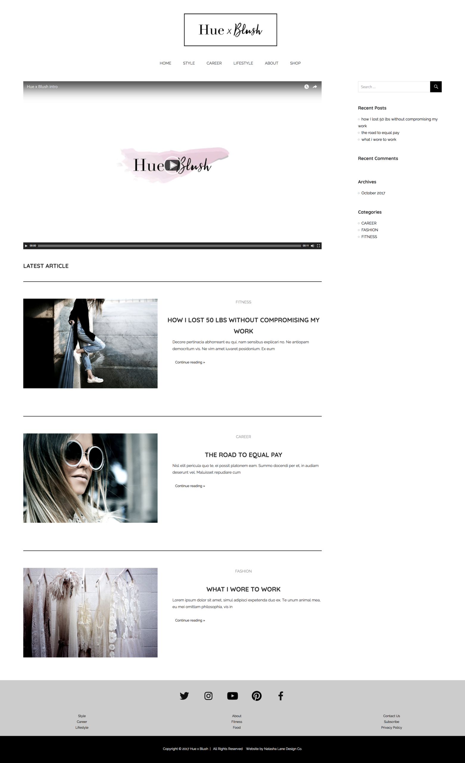
Website
Designer: Paigon Davis
Package: Multimedia Empire (coming soon)
Click here to view the website.
This is based on the logo x branding template. View the Logo x Branding template here.
Project Summary
Originally, Hue x Blush was inspired by fashion magazines. Surprisingly, the mood board came out differently than I first thought. So the brand went into a different direction. The brand is still minimalist in design, but with pops of colors.
Instead of black and white becoming the main theme, the colors became licorice and white smoke. Those colors, along with blue lagoon, dark sienna, and pale violet-red, became the main color palette. Because splashes of color are present, it’s the inspiration for the splashes of color on the variation logo. The splashes of color are also in the intro video.
Since the overall theme is minimalism, the intro video and outro graphics are kept simple and clean. The overall design of Hue x Blush is clean, minimal, and chic, with splashes of fun created by the patterns and colors chosen.

