If you’re a business owner, you might think that creating captivating YouTube thumbnails is hard, but it’s actually really easy. All you have to do is think of thumbnails as book covers. The only difference is that on YouTube, you are judging a book by its cover. If you’re just starting off making YouTube videos, the thing that will get viewers to click on your videos (besides SEO), is your thumbnail. Here are 5 easy tips for creating captivating YouTube thumbnails.
5 tips for creating captivating YouTube thumbnails
If your video is showing up on searches, you want to be the video that viewers click on. If the title and content are the same, hopefully, your content matches the title, the best way to stand out is your thumbnail. As a beginner starting off on YouTube it’s important to focus on the design of your thumbnail. Let’s get started.
01 Put a face on it
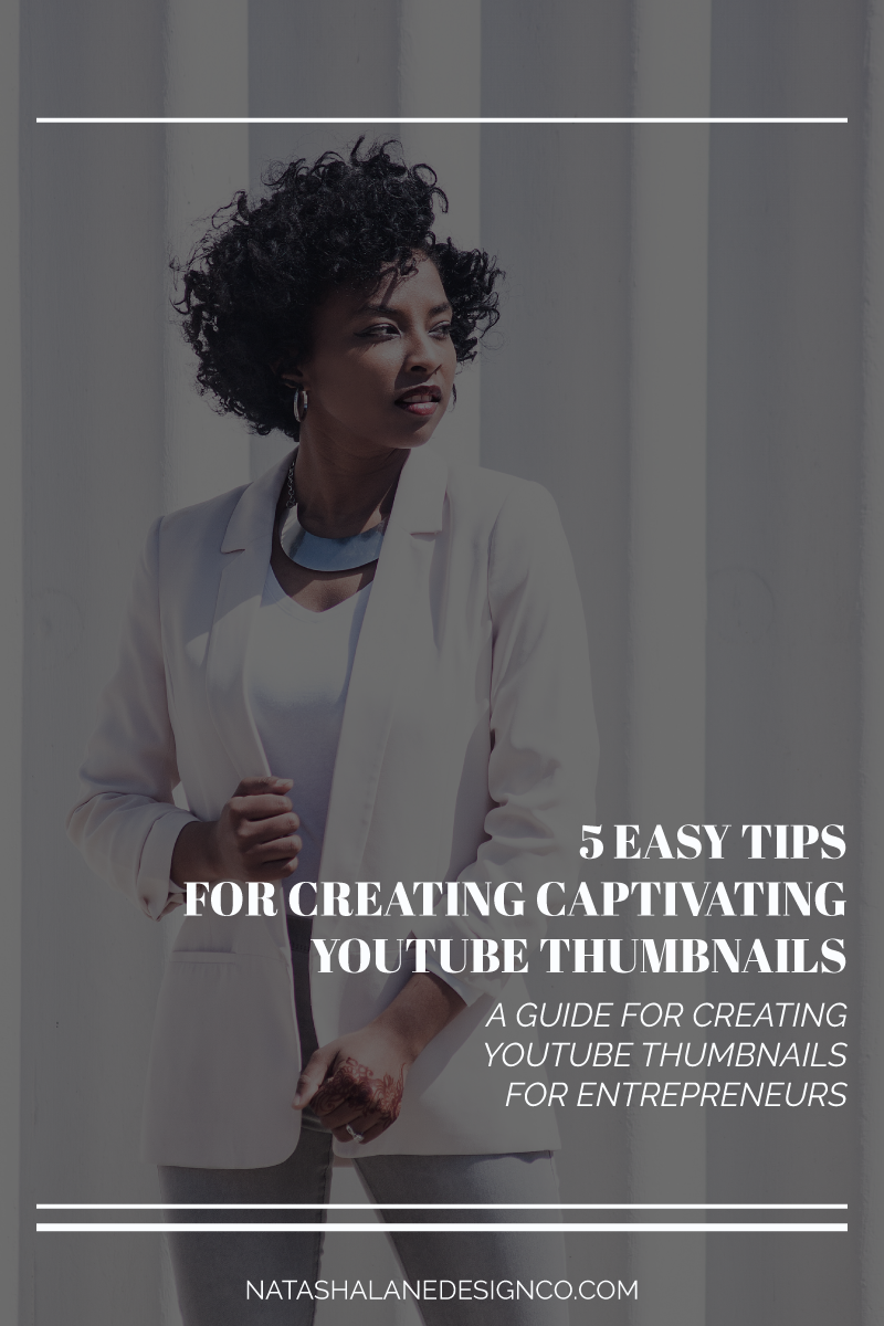
It’s time to start posing because faces are the way to getting noticed. No, really. A thumbnail with your face on it is more likely to get clicked on than a thumbnail without a face. That’s probably why you see all those goofy and extreme facial expressions on YouTube thumbnails. Am I telling you to go that extreme? No, but if you’re making videos showing your face anyway, then you might as well put it on your thumbnail.
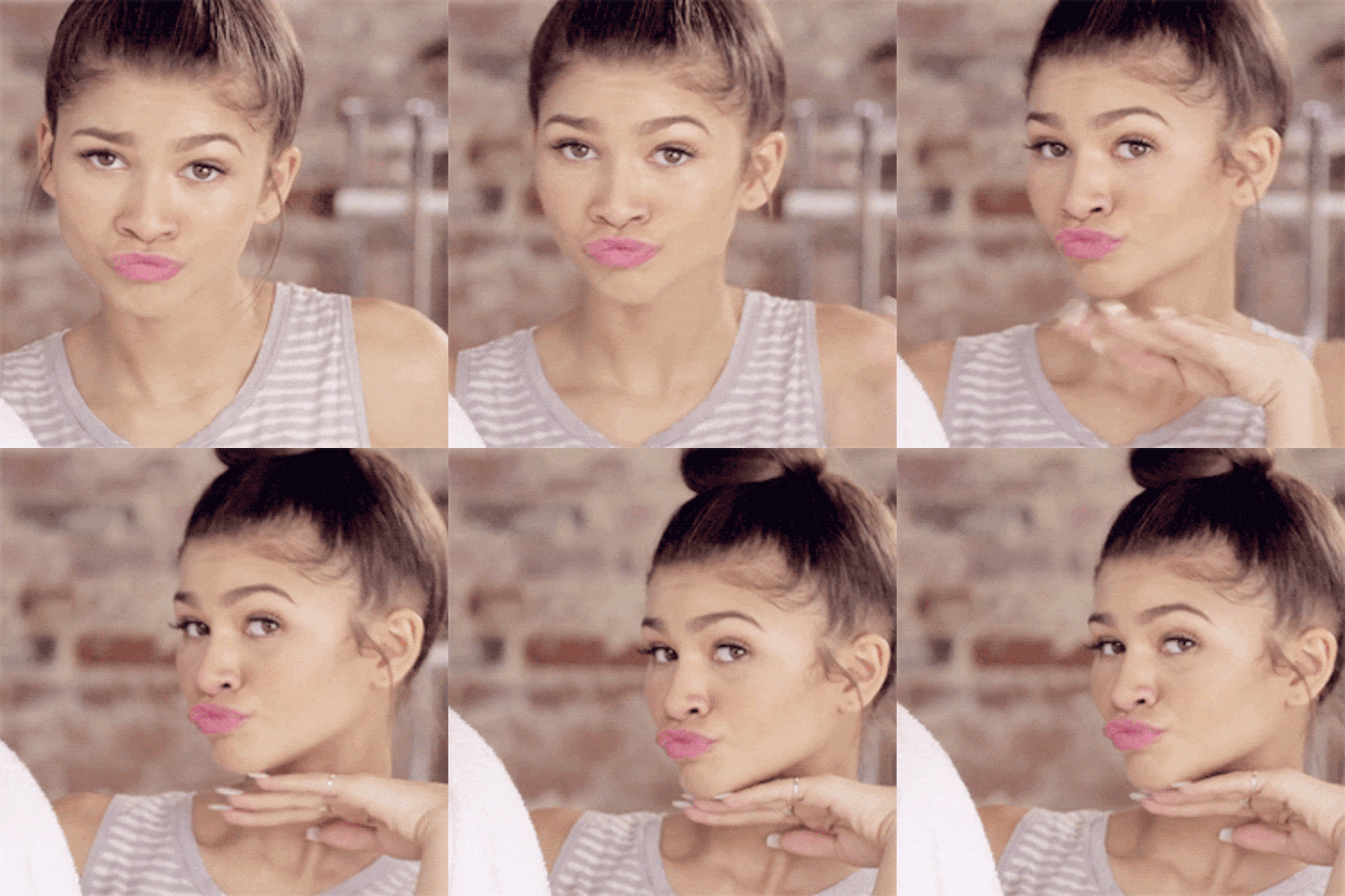
The easiest way to get your image is to make a still image from your video content. Sometimes this doesn’t always work, especially if you care about the way you look. I’m not going to lie, I definitely care about how I look, so when I’m editing videos, I try to pick a video that makes you look good. If you’re editing your own videos, there will be more times when you pause your video and you’re making an ugly face than a flattering one.
Because I know that image is important, I tell my clients to pose at the beginning of their video. Hit record and pose for 5 seconds, then do another pose, and another. It feels dumb, but you’ll have thumbnail choices that you won’t hate. If that’s too embarrassing or you want to have more control of your image, I have a client that takes selfies instead and gives those to me for her thumbnail options.
02 Text is everything
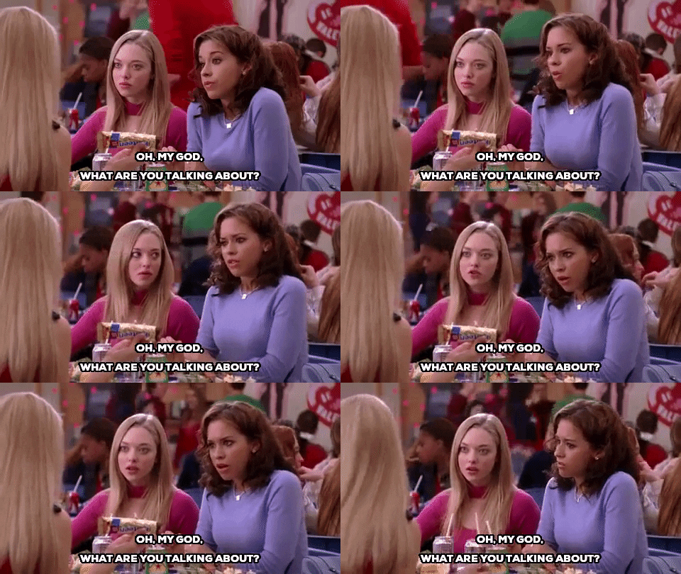
When you’re starting off with vlogging, having text on your thumbnails is really important. Why? Because no one will click on a video if they don’t know what it’s about. Here are some tips on creating the title for you YouTube thumbnail:
- Make sure the title is relevant to your YouTube video.
- Your thumbnail title doesn’t have to match the YouTube title.
- Try to make it short and catchy. Most people are skimming thumbnails.
[thrive_leads id=’3685′]
When you make it to the big time, you won’t have to worry about it. That’s why you see big accounts sometimes don’t have text on their thumbnails because people already know who they are.
03 Make it big
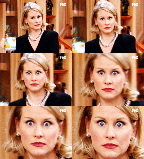
Everything on your thumbnail should be big. By big, the image should be a close up so that your audience can see what it is. The text should be big enough to read. If it can’t be read or seen, then it’ll definitely be disregarded.
04 Keep it consistent
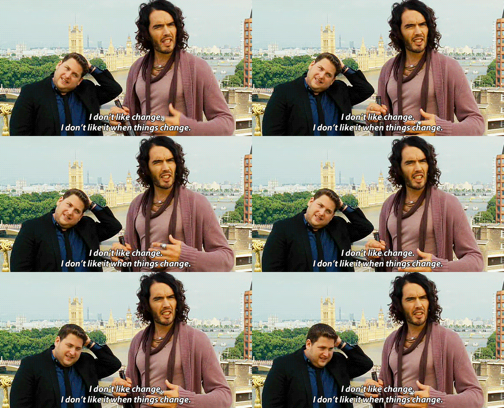
If you already have a brand, use your brand elements. If you don’t, then think about choosing a font that is legible on your thumbnail and keep using it every time. If you’re using colors, try to stick to the same 3 colors unless you’re going for that rainbow theme.
Why is branding important? Because you’re building recognition. If your audience keeps seeing the same fonts and colors, then they will come to recognize you for it. You don’t want to be a forgettable person on YouTube.
If you need help branding your YouTube channel, check out this free 5-day email course, Brand Your YouTube Channel.
05 K.I.S.S.
KEEP IT SIMPLE STUPID. You’re not stupid, but it’s a great, memorable acronym. Don’t overdo it and don’t overthink it. Even though this is important, you shouldn’t waste all your time on it. If you’re racking your brain trying to think of a title, just think basic. ‘What is this video about?’ or ‘What is it I want my audience to know?’.
The number one thing you should focus on is your video content. If your content sucks, then your thumbnail will be useless. I’m not saying that you should disregard your thumbnail, but if you’re not creating content because you’re thumbnail design skills aren’t great, then that would be a shame. Just know that you can always change your thumbnail later. It’s easier to change your thumbnail than your video.
I don’t have time for this…
If you skipped to the end, here are the 5 easy tips for creating captivating YouTube thumbnails:
01 Put your face on the thumbnail.
02 Add text.
03 Make everything big.
04 Brand it.
05 Keep it simple.
Do you have a YouTube channel? Let me know in the comments, so I can check it out.
-Paigon
[thrive_leads id=’3685′]

My channel is Murder She Drew. I do true crime and art combined. I’m new to this whole thing so my content is still pretty mediocre.
Oh, that sounds awesome! Congrats on starting your channel and creating content.
Hello! I am racking my brain on ideas on how to get more clicks. I think our thumbnails are pretty good but I need to find a way to make them better. Our channel is TerryX2Explore. Thanks so much!!
Terri
Thanks for your comment! I checked out your thumbnails and I think you should focus more on your thumbnail titles, placement of text, and images. For example, you had one thumbnail: top picks for RV camping. Instead, you could have made it more captivating by saying top 5 picks for RV camping or top 5 picks for surviving the wild (RV camping edition). Haha, sorry I don’t know anything about RV camping. There was another before and after thumbnail. For that thumbnail, I was interested in seeing the before and after images but it wasn’t shown. I hope these small tips are helpful.
I am new to YouTube and struggle with the the thumbnails. I’m going to change all mine now. Thanks for the tips
Yay, I’m glad it was helpful!
My channel is Deliberation Room! I don’t know if I should change up my format or not. Do you recommend anything?
I’m really impressed with your thumbnails! It works for your genre.
I would say make your text bigger, the biggest text should be the most important text. Also, try not to use a black background or choose one with a clearer image. If your audience uses a dark theme, then the thumbnail will blend into the YouTube background.