When I first started off with graphic design, typography was my biggest weakness. I didn’t know how to choose fonts. I made the whole idea very complicated. My teacher even said that I thought about it too much. When I knew what he meant, I felt really dumb.
I’m not going to say typography is easy, but it doesn’t have to be complicated. Here is the not so complicated way to think about type.
Choose Fonts: Types of fonts
If you’re a straight up beginner, then here is a lesson on the types of type. They also have different classifications/style within each, but we won’t go through the history or how each one evolved throughout time. I’m going to talk about the main 4 and try to simplify everything as much as possible.
Serif
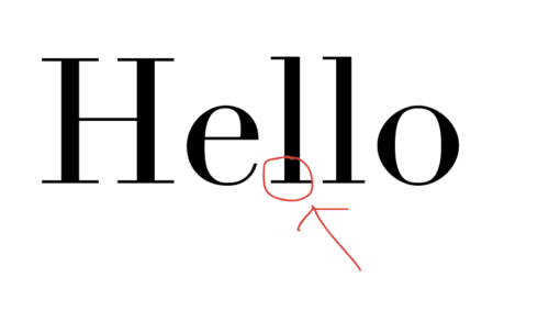
These are the fonts that have feet on them. This is probably the type that you are most familiar with. I say that because every time we had a report due in school, one of the requirements was to use Times New Roman. The fonts in this category are best used for printed material: school papers, books, magazines, etc. Examples include:
1. Times New Roman
2. Baskerville
Sans-serif
These fonts don’t have feet. You’re also familiar with these fonts because sometimes you had the option of printing your report in Arial for school papers. These fonts are used best for the web. Examples include:
1. Arial
2. Helvetica
Script
The fonts that look like cursive or handwriting. You’ll see them a lot on wedding invitations. It’s not very mainstream because it’s not legible like serif and sans serif, but it’s pretty. Examples include:
1. Brush Script MT Italic
2. Apple Chancery
Display
This one is a little confusing. Some sources say to use it sparingly because it’s decoration, but then it’s also described as regular text that is more enhanced to create a mood. I honestly love to use Raleway A LOT and it’s a display font. Examples:
1. Raleway
2. Abril Fatface Regular
The Web vs Print
As I mentioned earlier, serif is best for print and sans-serif is best for the web. Why is this the rule, because of readability. People can read sans-serif better on their computer and serif in a book.
Nothing is set in stone though. When I printed my reports I always liked to choose Arial. Maybe internally I was always biased towards sans-serif since I was young. I’m more attracted to modern, clean styles. Also, I think you could write less and get more pages out of a report using Arial. The point is to experiment but to keep your target audience in mind.
Pairing fonts
When it comes to pairing fonts, one of the biggest things to remember is, don’t pair the same type of fonts together. Plain and simple, it’s ugly. When pairing fonts it’s best to pair the opposites together. Just think opposites attract. Contrast is more appealing or at least more eye-catching. Examples:
- You can pair serif with sans-serif. (The same is true with the other type classifications).
- Skinny and fat fonts together.
- Tall and short fonts together.
- Curvy and straight fonts together.
- Wide and condensed fonts together.
If you still can’t match fonts together then pick one font family with a lot of family members. For example Helvetica. Below is a screenshot of all the Helvetica options.
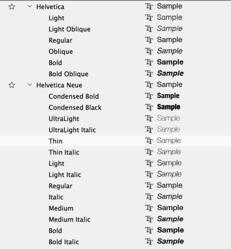
You can mix and match the family together to create a well-balanced design because no matter which family member you choose, they all go well together.
Choosing your font
When it comes to choosing a font for your brand all you have to think about is matching the mood of the font to your brand. If your brand is modern, maybe you’ll look through some sans-serif fonts. If your brand is super feminine then you might try looking through script fonts. The main thing to consider is your audience and brand style.
I mentioned earlier that my favorite typeface is Raleway. I also love Abril Fatface and Playfair display. Which are your favorites?
Here are some resources for further reading:
- https://www.fonts.com/content/learning/fontology/level-2/making-type-choices/selecting-display-type-getting-started
- https://en.wikipedia.org/wiki/Typography
- https://designschool.canva.com/blog/typography-mistakes/
- http://jessicahische.is/talkingtype
- http://www.hustwit.com/category/helvetica/
- http://www.webdesignerdepot.com/category/typography/
- https://designschool.canva.com/font-design/
- https://www.smashingmagazine.com/2010/12/what-font-should-i-use-five-principles-for-choosing-and-using-typefaces/
-Paigon | Natasha Lane Design Co.
P.S. Sign up below for the FREE Brand Your Own Biz email course.
[thrive_2step id=’3716′]

[/thrive_2step]